

What the Pentagon Pizza Theory Data Actually Measures
Before treating pizza-shop foot traffic as a war signal, I checked what the data really tracks and how the comparisons hold up.
SocietyDoes a Busy Pizza Place Near the Pentagon Mean a Military Operation Is Coming?
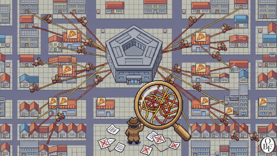
There’s a theory that when pizza places near the Pentagon get busier than usual, a military operation is imminent. It’s called the “Pentagon Pizza Theory,” based on the assumption that Department of Defense staff working late nights would be ordering pizza.
The story itself is easy to grasp. But nobody has directly observed whether overtime actually increased, nor do we know who ordered the pizza. If you want to infer a military operation from pizza shop activity, you need to verify that the link between the two actually holds.
As someone who teaches and practices data analysis, I found this case fascinating. It illustrates the gap between an explanation that sounds plausible and something you can actually use for prediction.
The Data We’re Looking At Isn’t Order Volume
The Pentagon Pizza Report account on X reports on activity levels at stores near the Pentagon as shown on Google Maps. According to Google, this busyness metric is estimated by anonymizing and aggregating visit data from users who have opted into location history. Real-time activity is displayed relative to typical visit levels. It’s not a tally of pizza orders placed or sales generated. Google’s explanation of visit data
So the mere fact that a store is busy can’t be read as evidence that delivery orders from Pentagon staff have increased. The traffic could just as easily come from nearby residents or other workplaces, and even if delivery orders did rise, there’s no guarantee that would show up proportionally in the visit data.
Marcel Plichta, a former U.S. Department of Defense analyst, has pointed out that which stores get included in the index is inconsistent, and that it’s hard to distinguish other sources of demand in the area. Plichta’s analysis
This is exactly what I’d want to check first. Just because the metric is called a “pizza index” doesn’t mean it measures order volume. You have to start by figuring out what the data actually records.
A Public Analysis Compared Two Military Operations
Keep the perspective, not the noise.
We choose one consequential shift and trace what sits beneath it, every other day.
Confirm once to finish subscribing.
Already a subscriber? Sign in to join the conversation



The author also compared activity at the nearby Freddie’s Bar. The reasoning: if both the pizza places and the bar got busy together, the increase might reflect general activity in the area rather than Pentagon overtime specifically. In an index that accounted for the difference in activity between the two locations, the author reported finding no clear spike before either operation.
But the data wasn’t a continuous observational record of the stores — it was a set of posts an account chose to publish. The author acknowledged that the selection criteria for the posts were unclear and the record incomplete. The right way to read this analysis is that, within this particular dataset, no predictive signal was found. Original analysis
Adding a Comparison Point Doesn’t Isolate the Cause
I liked the attempt to look at the bar alongside the pizza places. Before concluding anything from the pizza shops alone, the author tried to check whether other nearby venues were busy too.
But I don’t think subtracting bar activity leaves a “pure overtime effect” behind. The customer bases, business hours, and day-of-week patterns of bars and pizza shops can differ. There’s no guarantee the two types of venues respond the same way to a local event. Even after adding a comparison point, you still need to examine whether it’s actually the right comparison.
Days without any operation matter too. You can build a story just by finding a handful of pizza places that happened to be busy before an operation. But if those places are often busy anyway, their value as a predictive indicator is low. Conversely, if you drop the days when an operation happened but the shops stayed quiet, the indicator will look more accurate than it really is.
When I look at analyses like this, before jumping to a conclusion of “there’s a correlation” or “there isn’t,” I try to check which days were included and excluded. The comparison period and the data collection criteria can heavily shape the conclusion.
There Are Cases Where Public Data Revealed Hidden Facts
The economist Armen Alchian’s anecdote points to a different possibility. Alchian recalled that while working at RAND, he examined the stock prices of related companies to figure out what materials were used in the hydrogen bomb. Seeing the stock price of a lithium producer rise, he inferred that lithium was a key material. He recounted that after circulating a memo about it internally, he was ordered to retrieve it. An article recounting Alchian’s recollection
It’s an interesting case because it shows that you can infer facts not directly disclosed from public information. That doesn’t mean every indirect indicator will succeed the same way, though. You have to check, case by case, what’s actually driving the observed value and whether other explanations are possible.
The method of examining how stock prices or other indicators change before and after a specific event is called an event study. Even there, you need to separate finding a before-and-after difference from concluding that the event caused it. In the same way, plotting the pizza shop records against the calendar dates doesn’t by itself complete the verification.
Oswarld’s Lens
In writing about this story, I didn’t want to mock anyone who believed the pizza theory. Building a hypothesis out of a familiar behavior and trying to check it with public data is a worthwhile thing to attempt. But when the result differs from what you expected, or the data is insufficient, you also have to explain those limitations.
When I teach data-related courses at university, I emphasize the same point: distinguishing what was measured, what it was compared against, and how far you can extend the conclusion. Asking “what were the control variables?” is helpful, but simply including some doesn’t make an analysis valid.
Thanks to LLMs, the burden of writing code and organizing data has gone down. That, I think, has also opened up more opportunities to test hypotheses yourself. I welcome this shift. At the same time, I believe that the faster you can run the calculations, the more careful you need to be about whether your original question actually fits the data.
This particular analysis found no clear signal ahead of either operation, and the data collection itself had constraints. I think there’s value in spelling that result out. It goes one step beyond simply repeating a plausible-sounding story — it separates what was actually confirmed from what remains unknown.

The author, Kwangseob Ahn, is a professor in the Department of Business Administration at Sejong University and lead consultant at INLEVEL9. At the university he teaches statistics and data analysis courses such as business data management and business analytics, while in the field he leads GTM strategy and AI strategy consulting, designing the intersection of technology and business. He has published an academic paper on memory architecture for AI conversation systems (HEMA), and runs Daily Arxiv, a project that curates global AI papers daily. He completed a master’s program at Korea University’s Graduate School of Technology Management and holds a KMBA. He is the author of the book 《Those Who Outsource Their Thinking: Homo Brainless》.
Related issues
Orwell and the Jargon That Passes for Explanation
Rereading Orwell, I revisit the AI jargon in my own consulting work and ask whether specific language actually drives execution.
SocietyKnowing Jensen Huang's Habits Won't Make You Jensen Huang
Judging founders and building GTM strategy: same effort, different results—learning a success story isn't the same as living it.
SocietyAI Skills Aren't Enough Without Good Taste
People keep asking me what to do in the AI era, and I keep coming back to judgment, not just tool skills.
Society
Your take shapes the next issue
What resonated most in this issue, or where has your experience been different?